

Graham Quince
-
Posts
2,056 -
Joined
-
Last visited
Graham Quince's Achievements
")


-
Hi @gbligh Unfortunately, the data viewer will show all results. If you put the quiz into Exam Mode, this will disable the games.
-
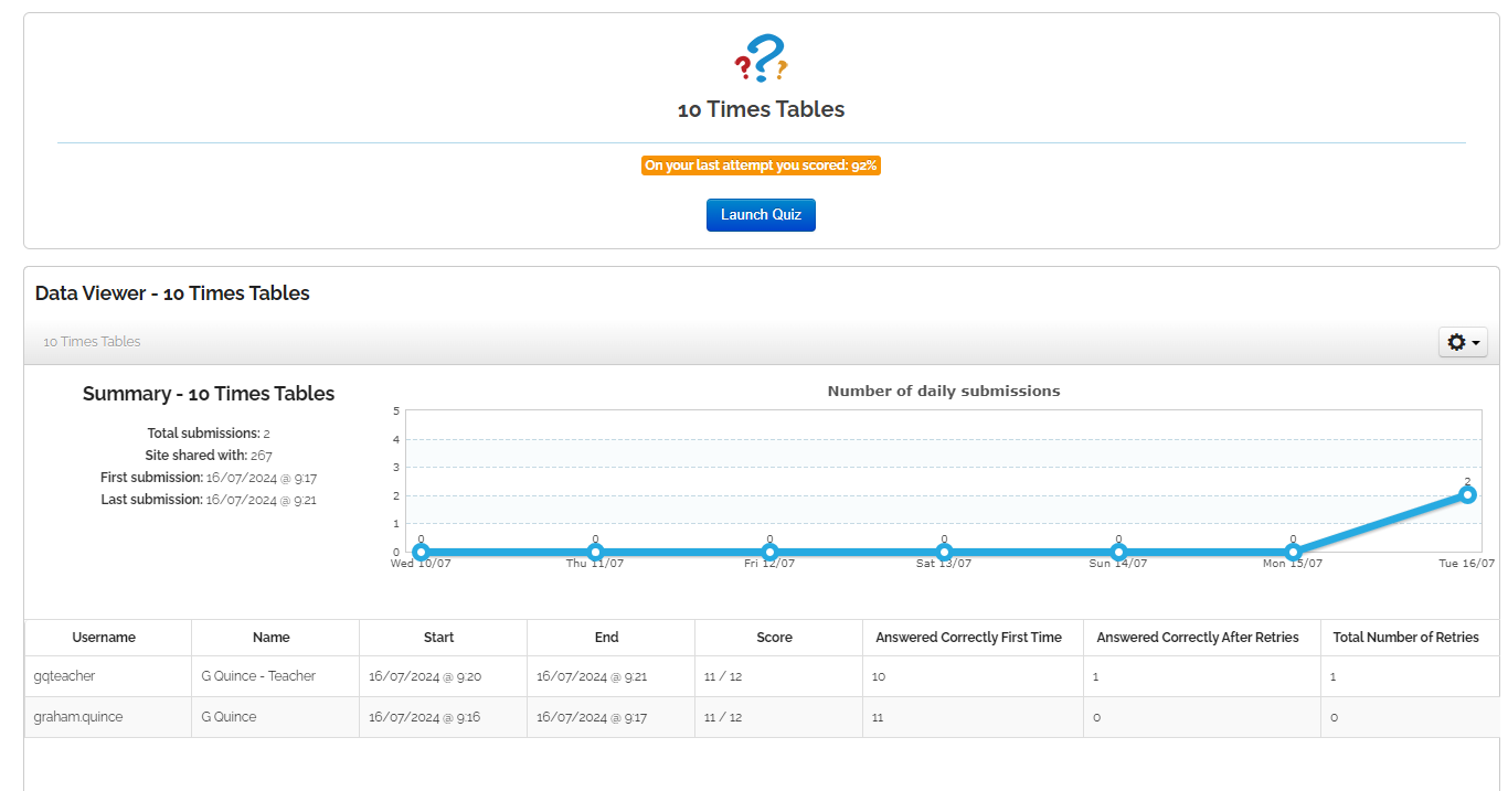
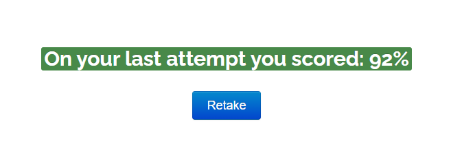
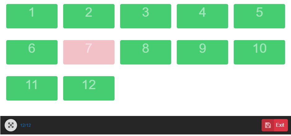
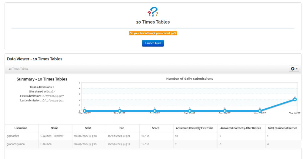
Depending on what settings you've set for you quiz (e.g. not in exam mode) staff should be able to see an immediate summary of how well they've done: They also see on the page the last attempt percentage: And if you add the Data Viewer to a page, they can see all the results: What you do not get is a Class Report / Quiz Report. That's limited to assignments only and you cannot set assignments to teachers. If you need to assess teachers, then maybe a form would be a better option. It won't do the marking, but you'd get the detailed answers;
-
To use your own image, upload it in the File settings options and at the bottom of the icon dropdown, there's an option for custom. Unfortunately due to the way Frog is coded, you cannot use the custom image for an uploaded file. Widgets only allow one file uploader. (I suppose you could upload the file elsewhere, then use the internet link option)
-
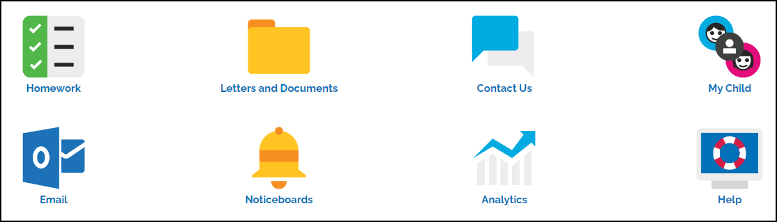
Inspired by the dashboards like Greenshaw, I've put together a new widget to make it slightly easier to create an icon driven menu. Image button (suggestions welcomed for a better name) comes preloaded with the icons available in the digital downloads section of the community. You can also upload your own images. https://www.frogeducation.com/frogstore/widget/image-button

-
The simplest way to find a Form's UUID is to add the following code to an HTML widget: <div class="form_list"></div> <script> var htmlWidget = arguments[0]; var formList = htmlWidget.find('.form_list'); var site = htmlWidget.closest('.sites_core'); var siteUUID = site[0].children[0].children[0].dataset.siteUuid; Frog.Model.api('dataviewer.getlist', { // look at all forms on the site module: 'form', current_user_only: 'true', site_uuid: siteUUID }).done(function(allFormsResponse) { $.each(allFormsResponse.data, function(index,form) { formList.append( '<li><b>'+form.title+ ' UUID:</b> '+index+'<br><br></li>' ); }) }).fail(function(e) { // Report Error Frog.Controller.prototype.growl('Failed to find forms.','HTML widget','app-name',{time:5000, icon: 'sites/widget/'+self.packageID+'/icon.png'}); }); </script>
-
We might be able to adapt the Parents Evening widget, but it is coded for times - rather than a seat. But a single form, set to Single Submission might work here.
-
Using this link: https://www.frogeducation.com/frogstore/widget/link-page-lozenge - the blue button on this page: https://www.frogeducation.com/download_file/e8ae4496-abb9-45b6-9efb-10f4a11a0b2c/3990
-
You can use CSS to force a new title and hide the old one, but it does tend to be problematic with different screen sizes. Alternatively, you could embed the app into a site and then name the site whatever you want.
- 1 reply
-
- 2
-

-
Strange it works for me, could it be blocked by Newcastle?
-
The Link to Page Lozenge has been updated to version 5, changes in Turing prevented it working as it used to.
-
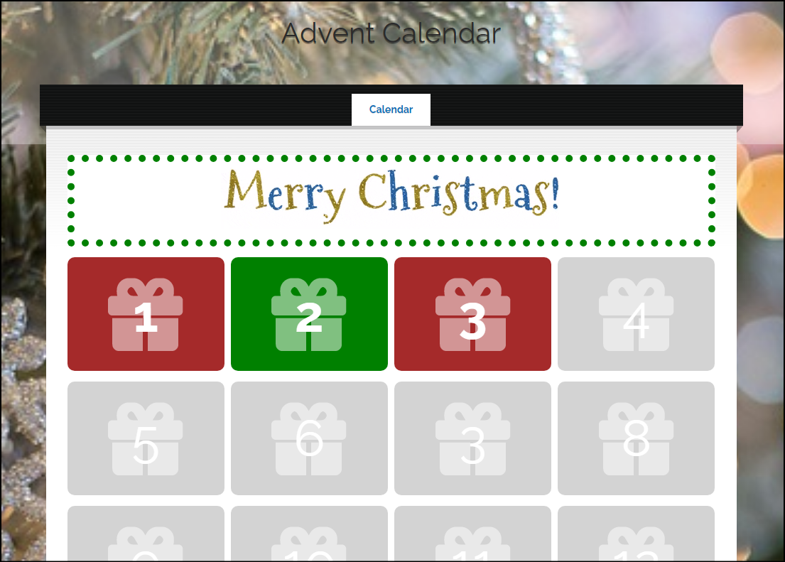
It was very quiet in the last couple of days leading up to Christmas, so I finally got a chance to put together an advent calendar. Obviously too late for 2023, so all the links are set up for December 2024. There's 48 images on the front page, with Rules managing their visibility. Each "door" links to a different hidden page. There is a fun bit of trivia on each page, but I'd strongly encourage you to edit this and make it your own - you could add: prizes quizzes walls pictures videos messages from teachers You can find it on the FrogStore along with an example with a few open pages. https://www.frogeducation.com/frogstore/content/advent

-
Love the King's speech stat!
-
I'll try to find some school contacts for you from the big FrogSnap users, but that's an interesting position by your data team. I take it all the controls around clearing images held no sway with them?
-
Hi Paul, I'm sorry you're having issues with the signage widget. I'll drop you a line and we can discuss it. Graham
-
Using the Pencil icon on the Quick launch, you can remove all the links you've set Globally and for yourself, but you can't remove links individuals have made. These links are by definition the links an individual wants quick access to.