Been having a play with this and thought I'd add what I had managed to do to style up the widget
<style>
.widget_sharedfolders .content-wrapper:before {
content:"Useful Downloads";
height:30px;
background: rgb(180,227,145); /* Old browsers */
background: -moz-radial-gradient(center, ellipse cover, rgba(180,227,145,1) 0%, rgba(33,127,12,1) 100%); /* FF3.6-15 */
background: -webkit-radial-gradient(center, ellipse cover, rgba(180,227,145,1) 0%,rgba(33,127,12,1) 100%); /* Chrome10-25,Safari5.1-6 */
background: radial-gradient(ellipse at center, rgba(180,227,145,1) 0%,rgba(33,127,12,1) 100%); /* W3C, IE10+, FF16+, Chrome26+, Opera12+, Safari7+ */
filter: progid:DXImageTransform.Microsoft.gradient( startColorstr='#b4e391', endColorstr='#217f0c',GradientType=1 ); /* IE6-9 fallback on horizontal gradient */
display:block;
width:100%;
padding:10px;
font-weight:bold;
color:black;
text-align:center;
font-size:32px;
font-family:"Arial";
}
</style>
<style>
.widget_sharedfolders .resources-container {
background: #eeeeee; /* Old browsers */
background: -moz-radial-gradient(center, ellipse cover, #eeeeee 0%, #cccccc 100%); /* FF3.6-15 */
background: -webkit-radial-gradient(center, ellipse cover, #eeeeee 0%,#cccccc 100%); /* Chrome10-25,Safari5.1-6 */
background: radial-gradient(ellipse at center, #eeeeee 0%,#cccccc 100%); /* W3C, IE10+, FF16+, Chrome26+, Opera12+, Safari7+ */
filter: progid:DXImageTransform.Microsoft.gradient( startColorstr='#eeeeee', endColorstr='#cccccc',GradientType=1 ); /* IE6-9 fallback on horizontal gradient */
}
</style>
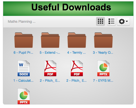
First I used http://www.colorzilla.com/gradient-editor/ to make some gradients and used them as my background colour for the top bar. I then added a little to Grahams css by adding in the 'color:black;' to change the colour of the font, aligned the text in the center, changed the font size and family.
I then found that the inside of the box is .resources-container so changed the background of that to make it stand out a little more.
I've attached an image of the one that this creates. Not the one I went with but not a bad first attempt.


")


 Phil T changed their profile photo